ASPO
An AI-powered platform that streamlines pre-production by uniting scriptwriting, and media generation in one collaborative workspace.
▪UX/UI design ▪Freelance ▪ Contract

Pulse Design System
Designed components, established themes, and defined guidelines for consistent usage.

SpiceUp
An app that makes cooking smarter, using what’s already in your kitchen.

More Works
Problem Statement
What is the Solution?
Core Topics Covered:
Affinity Diagram
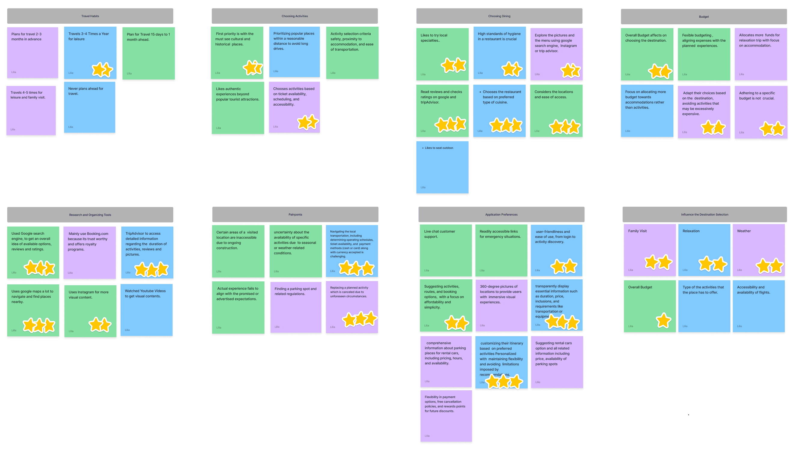
Key Themes from the Affinity Diagram
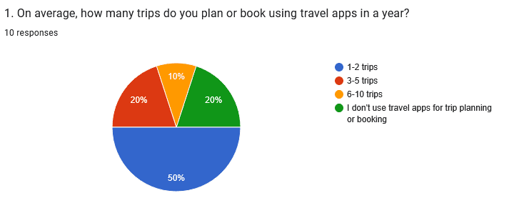
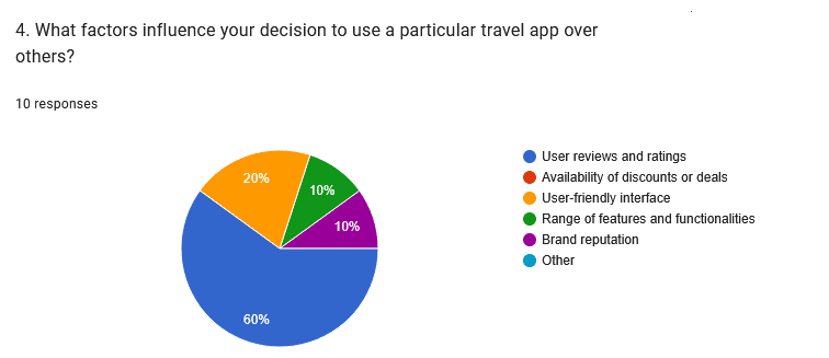
To understand the broader applicability of the themes identified in the interviews, I conducted a survey with a larger group of travelers. The survey aimed to gather quantitative data on their trip planning habits, pain points, and preferences.
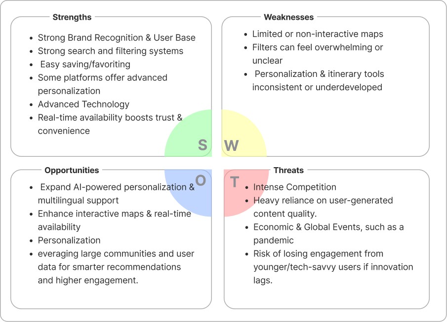
SWOT Analysis
I synthesized insights from heuristic evaluations of competitor platforms and qualitative analysis of user reviews to identify:
Feature Comparison
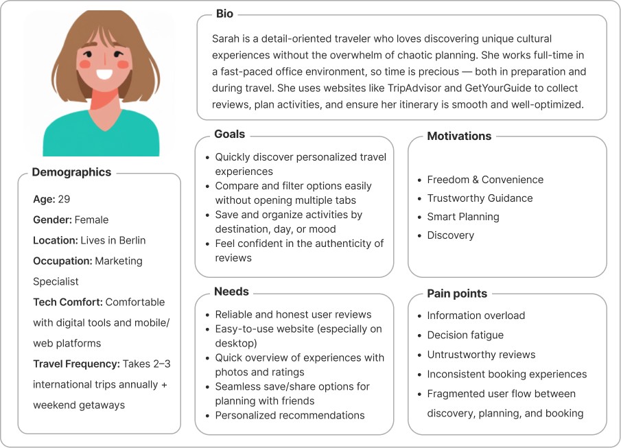
User Persona
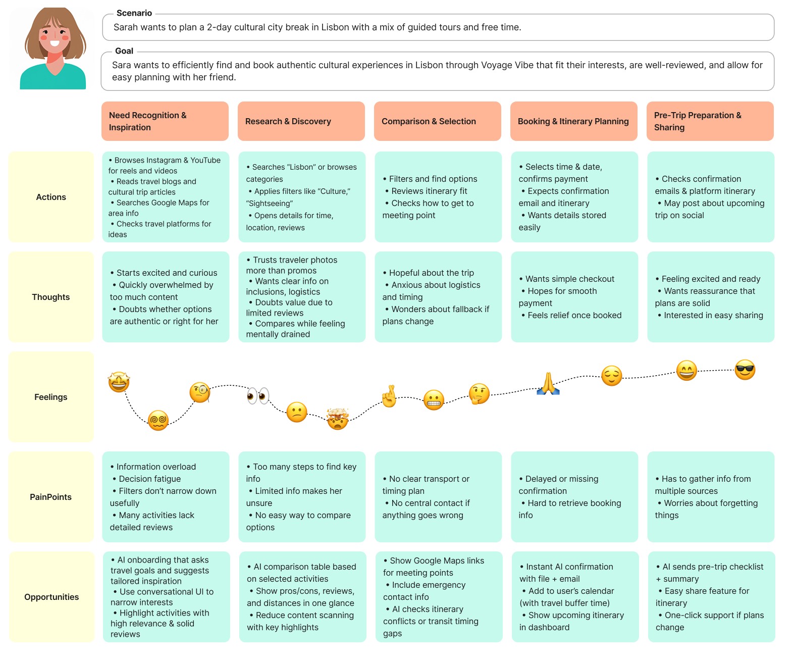
User Journey Map
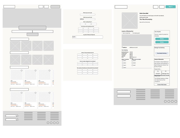
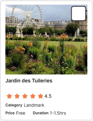
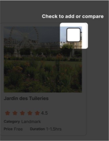
Checkbox Visibility Issue:
Users often overlooked the checkbox on activity cards because it blended with the card design.
→ Solution: I increased the checkbox size, applied a thicker border for higher contrast, and added a coach marker (tooltip-style guidance) to explain its function when users first enter the page.
Before
After
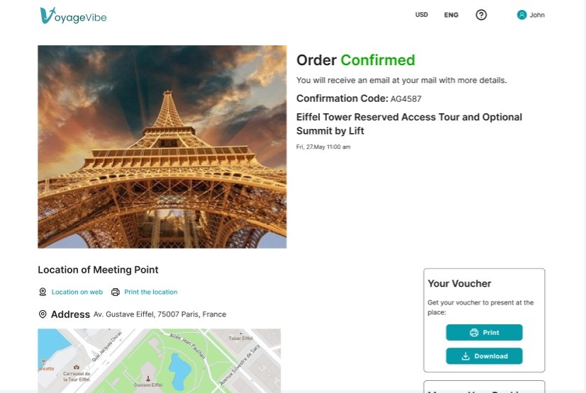
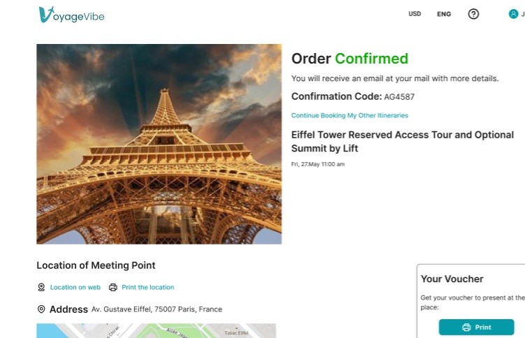
Navigation Gap After Booking:
Once users confirmed an activity booking, they were stuck on the confirmation page without an option to return to the itinerary.
→ Solution: I added a "Back to Itinerary" button on the confirmation page to allow users to seamlessly continue booking other activities.
Before
The final design combines user feedback with a sleek, intuitive interface. Users can easily find healthy, quick recipes that match their preferences.
I realized how crucial it is to recruit the right participants for user interviews. Selecting users familiar with digital tools and similar travel apps provided actionable and relevant feedback during the early design stages.
Testing with users of different digital adaptation level and age ranges revealed that what feels intuitive to one group can be confusing to another. Including a variety of users helped uncover accessibility challenges and usability gaps that might otherwise have been overlooked.
I learned that solving problems doesn’t always require a full redesign. For example, I redesigned the login flow for the AI itinerary feature. Users could explore and create their itinerary first and only log in if they wanted to save or book it. This gamification of login turned it into a reward rather than an obligation, which can lead to reducing friction and improving engagement.
I used AI as a brainstorming partner during ideation sessions. Using outcomes from the research phase, I crafted “How Might We” questions, generated feature ideas, and prioritized them using impact-effort metrics. This made the ideation process faster and more structured.
If I were to redesign VoyageVibe, I would enhance the AI feature with a conversational chatbot. Users could interact through a mix of guided automatic options and free-form input to refine their itinerary. This approach would make planning more interactive, personalized, and engaging, while still leveraging AI for efficiency.
If this were a live project, I would track these metrics:
Engagement with the AI itinerary feature (creation rate, time spent)
Login completion after creating an itinerary
Booking conversion rate
Drop-off points in the flow
Return rate and user satisfaction scores (NPS/CSAT)

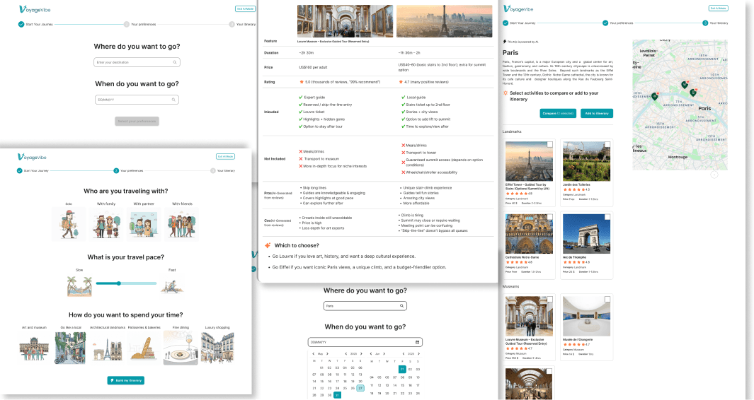
Voyage Vibe
AI-powered travel planning quickly generates personalized itineraries.
▪UX/UI design ▪ Case study ▪ Personal Project
Challenge :How might we make trip planning faster and more enjoyable by guiding users to personalized, confidence-boosting choices?


