ASPO
An AI-powered platform that streamlines pre-production by uniting scriptwriting, and media generation in one collaborative workspace.
▪UX/UI design ▪Freelance ▪ Contract

Pulse Design System
Designed components, established themes, and defined guidelines for consistent usage.
▪UX/UI design ▪ Case study ▪ Concept Project

VoyageVibe
AI-powered travel planning quickly generates personalized itineraries.

More Works
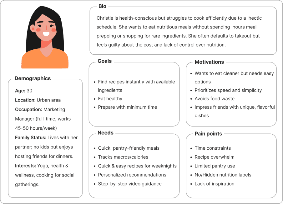
Persona
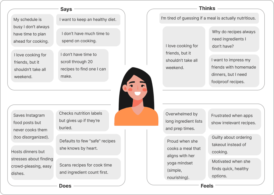
Empathy Map
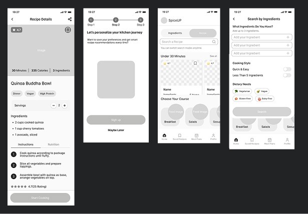
Search by Ingredients Mode
The homepage search bar includes a dedicated mode allowing users to find recipes based on up to 3 ingredients they already have
Dietary Preferences (Accessible to All)
Unlike competitors who gate this feature behind login walls, dietary and allergy filters are freely available to all users as part of the core filtering system.
Meaningful & Intuitive Filtering
Filters are logically categorized and designed with appropriate UI patterns (checkboxes, radio buttons, toggles) to help users quickly distinguish and apply them—reducing time spent searching for the right option.
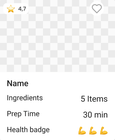
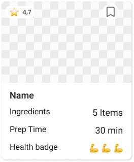
Informative & Scannable Recipe Cards
Recipe cards display essential decision-making information upfront, optimizing scanability, comparability, and speed in the selection process.
1.Seamless Exploration
Allowing users to freely browse recipes without requiring an account.
Progressive Filtering
Enabling users to apply essential filters upfront, then refine results further with extended filters after the initial search.
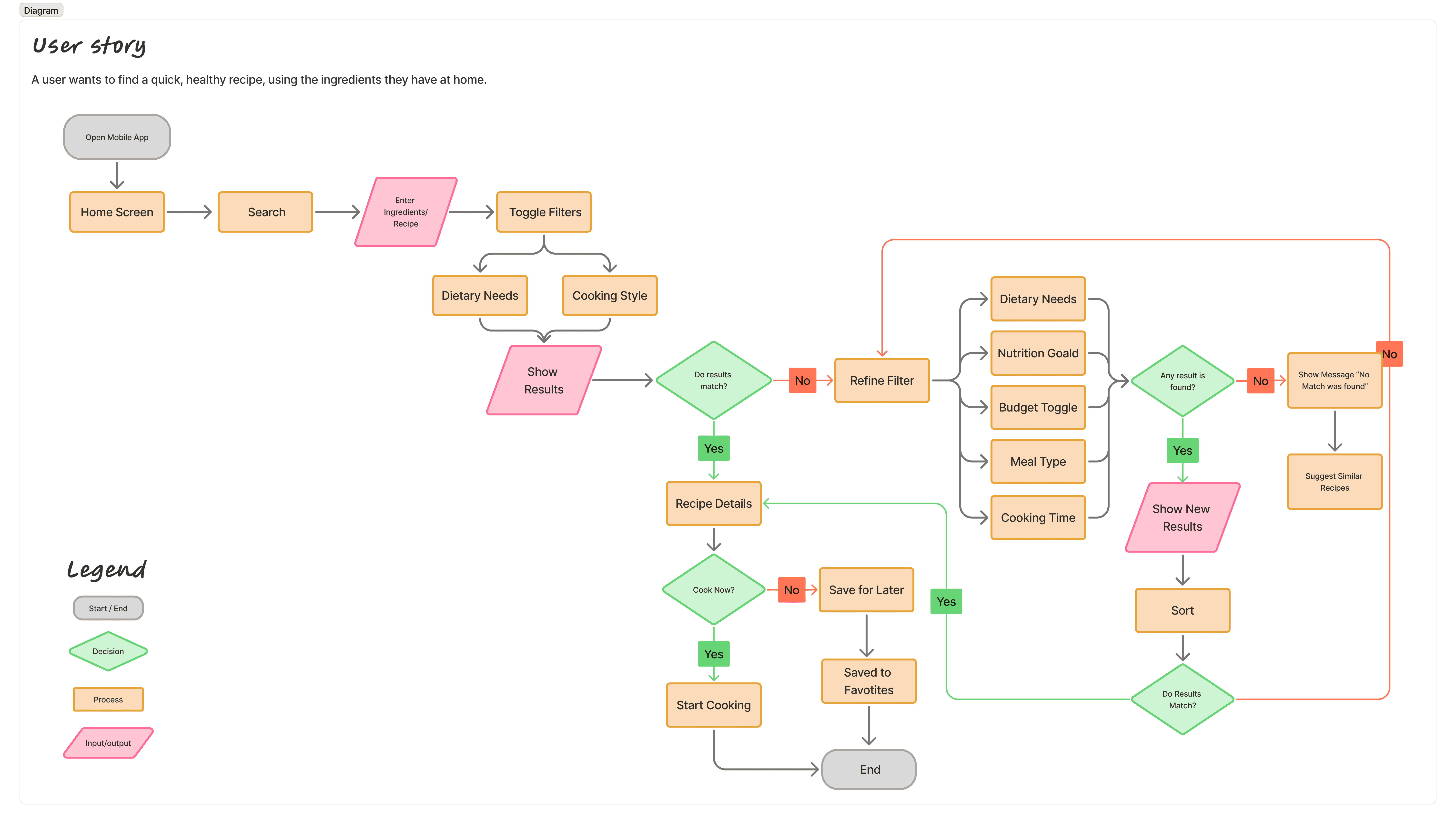
After defining the core features and user flow, I created mid-fidelity wireframes to visualize the layout and functionality of the app.
Before
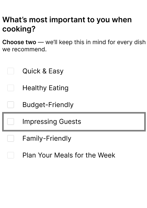
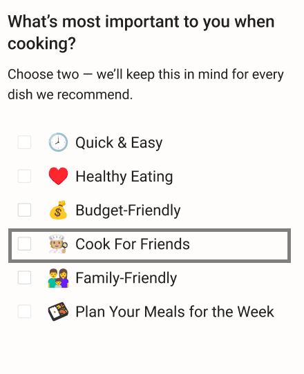
Some microcopy in the onboarding process was unclear and caused confusion for users.
After
I rewrote the microcopy using simpler and more direct language to improve clarity.
Before
The "Save Recipe" function was represented by a heart icon, which users misinterpreted as a "like" feature rather than a way to save recipes.
After
I replaced the heart icon with a save ribbon icon to better align with user expectations.
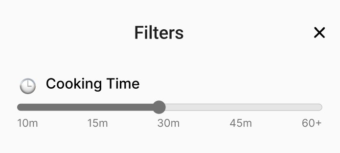
Before
The cooking timer placed above the filters was often overlooked by users.
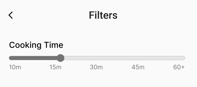
After
I added a timer icon to draw more attention and improve visibility.
Balancing User Needs and Business Goals

SpiceUp
Discover healthy recipes in seconds with SpiceUp—the app that makes cooking smarter, using what’s already in your kitchen.
▪UX/UI design ▪ Case study ▪ Personal Project
Challenge : How might we help time-strapped home cooks quickly discover healthy, pantry-friendly recipes?


